Tuesday 24 September 2013

LIGHTING


LIGHTING DEFINITION: Lighting is an important factor in photography. Photographers use light in different ways in all of their photographs. Sometimes they take advantage of the natural light that may be in their picture but other times they change the light to achieve the lighting effect they were after. By positioning and arranging the lighting in different ways it can totally change the theme or style of a photograph, even if it is natural light it can still be manipulated.

FACTUAL: This eye-catching photograph was taken by Perou a British fashion, portrait and music photographer who has also appeared as a judge on Make Me a Supermodel UK. Perou was park of a TV series called "Dirty Sexy Things" which aired in 2011, he photographed models to put in his exhibition at the end of the series..

The CONTEXT: This photograph was taken for the TV show 'Make Me A Supermodel'. This photo is of the two models in a Plexiglass box, which is suspended above the ground. The fact that they are hanging in a box may be telling a story, that in their lives they are constantly on the edge and can't escape from it. In this photograph Perou has made use of the natural light which is the advantage of taking the picture outside. If you look really closely you can see what looks like a house reflected in the box. The box also changes the light because of the way the rays refract as they exit and enter the glass. This photographs looks like it was taken on an industrial estate because of the buildings behind which look like factories, I think the box that the models are in is being lifted by a crane because it suits the industrial atmosphere. This photograph fits in with Perou's work because most of his pictures are well lit and all the ones I have seen include people, and this particular photograph fits in with his other 'Make Me A Supermodel' shots.

TECHNICAL: I think this photograph was taken in the streets with a DSLR Camera because it looks like a recent picture. The models and the box are in focus but the background is blurry, giving this picture a long depth of fields because it extends behind the point of interest. I think Perou will have avoided using the flash when taking this picture because it would have reflected off the glass and back into the view of the camera. I think Perou will have used some artificial lighting to make the models' features stand out and make them more noticeable, the lighting makes the male models muscles look bigger than they probably are. The plexiglass box which has lots of reflections highlights the models. And once your eyes goes straight to the models you start to notice their features and their clothes.

AESTHETICS: I really like this photo because it is really different and unusual, because they are in a glass box you get interesting reflections on the sides of it. I like the fact that the models are on their knees because it means you can see what is behind them more easily than if they were blocking it by standing up. Even though the women and the man are the main attraction I think Perou would have wanted the viewer to notice the people standing around the box. I like the fact that there is an audience in this picture because it shows people in the picture are excited by what is going on as well as I am. Perou will have chosen specific clothes for the models to wear, and I think his choice is very effective. The women is wearing black and white which creates a pleasing contrast. The man is only wearing boxers and shoes, which makes the photograph more appealing to the female eye.

EXAMPLE:
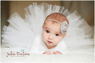
This picture has good lighting which makes the white dress more noticeable than the dull background. This dress outlines the babies head as well as the little headband. The light reflects off the white dress which makes the photograph seem like it has lots of light. The light in this picture would have been artificial and it would have been positioned in a certain way.
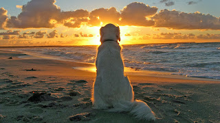


This is another example of a picture with good lighting. The light rays from the sun shines on the centre of the photograph and highlights the dog's body. The bright light that appears in this photograph is mostly blocked by the dogs head, the light becomes dimmer near the tail of the dog and outlines the retriever well. The dog is the main focus in this picture, this picture is interesting because it doesn't follow the rule of thirds. The sun lights up the sea and the beach as well as the dog. This certain picture also raises the question of what kind of sunset can the relaxed looking dog see. In this photograph the photographer has taken advantage of the beautiful natural light that comes from the evening sun.


http://www.picomazing.com/the-dog-wallpaper/
http://julietinton.squarespace.com/julietintoncom/2013/1/9/edinburgh-baby-portraiture-alma.html
http://www.ehow.com/about_6551792_definition-lighting-photography.html 
 

Monday 23 September 2013

COMPOSITION


COMPOSITION DEFINITION: The way in which you arrange the different parts of a photograph. In this photograph different things have been arranged on different third lines. The bag has been placed in front of Sean Connery's foot who is sat along one of the third lines. The board and the post lies on a third line as well as the beach, the sky and the sea on the left hand side of the picture. This shows that Annie has considered composition when taking this photograph.
Photo Composition Rules:
  • The Rule of Thirds
  • The Diagonal Rule
FACTUAL: This is a photograph by Annie Leibovitz of Sean Connery, a famous Scottish actor who has starred in seven James Bond movies. Annie has taken many pictures of celebrities including Anne Hathaway, Johnny Depp, Meryl Streep and of course Sean Connery.

The CONTEXT: This photograph is set on a beach that has clear blue water and a blue sky above it. The sand dune is lined with long green plants which lead away behind Sean. He is sitting in the place that your eye natural goes to and because he is leaning on the post it makes him stand out even more. In this picture Sean isn't looking towards the camera, he is looking into the distance which makes us wonder what his eyes can see. Annie has a tendency to take her photographs with unusual and exciting backgrounds which interest the viewer to the extent that people start to read into the picture, she also creates an interesting foreground with a model dressed up in interesting clothes. This photograph fits in with some of her other pictures because the models are usually sitting down in different and exciting places and positions, but quite a lot of the photographs I have seen have fantasy settings with princesses and Disney characters.

TECHNICAL: I think this photograph was taken with a DSLR camera to make sure the picture is sharp. I think Annie will have used something to make sure the sun wasn't shining directly on Sean to avoid any rays reflecting into the camera. In the photograph Annie will have used specific lighting. In the picture that shows Annie taking the photograph there looks like there is some sort of sheet to block some of the sun and shade Sean's body. What Sean is wearing is simple but effective, it is casual beach wear.

AESTHETICS: I really like this photo because the colours go well together and the grass on the left outlines the photo and makes the edge busy. The photograph is appealing especially to the female eye because of Sean, who goes well in this photo because like the sea he is calm and relaxed. Annie has put a lot of thought into this picture, because of the time of day that this picture was taken the clouds are filling up a certain amount of the sky making it look busy. They also lead away from over the long grass to near the dark horizon.

EXAMPLE:
The Rule of Thirds: The human eye is naturally drawn to a certain point, and this point is about two-thirds up a picture. So by putting the main attraction in one of the points that the eye goes to follows the rule and makes an eye catching photo. But sometimes by putting the main attraction in the centre, therefore not following the rule, can have an interesting effect. The red crosses on the picture below show the points that your eye naturally goes to, the other picture is a photograph which follows by the rule of thirds.


The Diagonal Rule: One side of a picture is divided into two and then each half is divided into three parts. The important elements are put on these lines. Diagonal lines lead the eye in and in this picture the main line almost cuts the picture in half.


http://petapixel.com/2010/08/25/behind-the-scenes-of-annie-leibovitz-shooting-sean-connery-for-louis-vuitton/
http://digital-photography-school.com/rule-of-thirds
http://www.photographymad.com/pages/view/10-top-photography-composition-rules
http://www.colorpilot.com/comp_rules.html
http://blogs.egusd.net/haynesphotosakauye/2013/03/14/photo-composition-techniques/


Saturday 21 September 2013

FOCAL POINT


FOCAL POINT DEFINITION: The focal point is what you as the viewer sees first, it is the main point of interest. In this photograph by John Hedgecoe your eye goes straight to the Henry Moore's hands and his face. Even though this photograph is black and white Henry stands out against the dull background. By having a focal point engages the viewer.

FACTUAL: This picture is by John Hedgecoe, an award-winning British photographer who is the author of over 30 books. He is a photographer who has taken many black and white photographs and established the photography department in 1965 at The Royal College of Art. Hedgecoe has taken pictures of other people such as the Queen, a photograph which would have been an honour to take.

The CONTEXT: This photograph is of the famous sculptor Henry Moore with his hands stretched out in front of him. This is representing what he does for a living. His hands which he used for making sculptures create a natural frame for his head, therefore making it more noticeable. This photographs fits in well with John Hedgecoe's theme because most of them are black and white and this may be because he was born in 1932 and a black and white film camera would be the only thing that he had. This also fits in well with his other pictures because he has taken many pictures of famous people.

TECHNICAL: I think this photograph was taken in a studio because of the plain background with a black and white film Camera. There is a dark shadow that outlines Henry and makes him stand out from the rest of the photograph which makes him the focal point. I think to get this effect specific lighting was used to create the shadow. This photograph does not follow the rule of thirds but by putting Moore in the centre creates an interesting picture.

AESTHETICS: The eye goes straight to Henry and I like this picture a lot because his hands create a frame and I think it is really interesting and different to any other frames. And I love the fact that his hands are the main attraction because that is the element in the picture that represents his job. I like the depth of field in this picture because it is different to any other photographs with that aspect I have seen. Henry is using his hands to create the depth of field, I think it creates a very effective image.

EXAMPLE:

This picture has no focal point because your eye does not go to a certain point. Your eyes go to the blue and white stripes, but they do not go to a certain one. If there was a bird flying above the sea or a boat on the sea then that would give this picture a focal point.


But in this photograph there is a focal point. The half of the sun which is reflected in the water appears as a full sun. This photograph follows the rule of thirds, but if the sun was anywhere in this picture I think it would still be the main attraction as it is brighter than the other objects. And the reflections creates an amazing photograph which I like very much.


http://www.flickr.com/photos/43169266@N03/6398651445/

http://funlava.com/sunset-pictures/

http://www1.topfoto.co.uk/gallery/JohnHedgecoePortraits/ppages/ppage20.htm


Wednesday 18 September 2013

DEPTH OF FIELD


DEPTH OF FIELD DEFINITION: The depth of field is the distance between the nearest and furthest objects. The area within the depth of field appears in focus. In this photograph the foreground appears sharp and the area beyond appears blurry. Landscapes tend to have long depths of field whereas portrait photos tend to have shallow depths of field.

FACTUAL: This photograph is by an American photographer, Annie Leibovitz who became well known for her work with The Rolling Stones, who has also taken a picture of John Lennon.

The CONTEXT: This photograph is of Jude Law and a black Labrador. By what Jude is wearing and the fact that they are on the boat makes him look like an adventurer. There is also a hat resting between the boat and the board which makes him look more than just an adventurer, it makes him look like Indiana Jones. The river beyond him is blurry, so we don't know where he could be going. This picture raises many questions such as, where is he heading? This picture fits in with the theme of a few of her other photographs because no vibrant colours were used, the model is looking into the camera and it is like one other photo I have seen because an animal was used, in this case, the dog.

TECHNICAL: The size of the depth of field depends on 3 factors: the distance you are from the subject and the aperture and the focal length of the lens. I think this photograph was taken with a DSLR camera because it looks like a recent photo. I think some artificial light has been used to create the shadows on the river but she has also taken advantage of the natural light that shines on the river and that comes through the tree that Jude is sitting next to.

AESTHETICS: The sharpness of the foreground makes the characters in the photograph stand out. The sun shining on the water behind makes it look white, and when dark colours are put in the foreground it creates an aesthetically pleasing contrast. I really like this photo because Jude looks handsome and by seeing the river behind him makes you as the viewer read into it. I think by having the dog in the photo makes it interesting and better than if it was just Jude.

EXAMPLE

This photograph demonstrates a shallow depth of field, the main flower in the picture is enhanced while the other flowers are out of focus. In this picture there is limited depth of field because only a small amount of the picture is sharp.


This photograph demonstrates a long depth of field, it extends in front and behind the point of interest, which are the rocks and their reflections.


http://3oneseven.com/17/annie-leibovitz/annie_leibovitz_1/

http://en.wikipedia.org/wiki/Depth_of_field

http://www.ephotozine.com/article/depth-of-field-explained-4631

http://www.mir.com.my/rb/photography/fototech/htmls/depth.html


Wednesday 11 September 2013

FIRST ANALYSIS


FACTUAL: This image is by Annie Leibovitz. She is an American Portrait Photographer, who I think, takes imaginative photographs which stand out. In many of her photos the models are looking directly at the camera, which helps us connect with the person in the picture because there is eye contact.

The CONTEXT: This photo is one of the two photographs I have seen of Anne Hathaway, but is one of the many photographs I have seen with dull backgrounds that have more exciting colours in the foreground. This is a technique she often uses.


TECHNICAL: I think that she has taken this picture in a studio with a Digital SLR Camera on a tripod to make sure that the image is clear. I think she will have used specific lighting effects to create the image she wants.

AESTHETIC: What I like most about the photo is that by using a dull background and a bright, noticeable colour in the foreground the red stands out more than if there was a very colourful background.

POINT OF INTEREST: The primary point of interest is Anne Hathway, because that is where your eye goes to when you see the picture.

SIMPLICITY: This photograph is simple because there is nothing cluttering up the background, and by having this plain background it puts emphasis on Anne.

CONTRAST: Anne Hathaway's light skin with the red sheet against the dull background creates contrast. This contrast draws our eye into the photograph and more specifically 
Anne.

FRAMING: There is no framing in this picture,Annie Leibovitz doesn't use much framing in her photographs. Personally I like it when it is used because it outlines the main subject and leads the eye in and interest me more as a viewer.

VIEWPOINT: By the looks of this picture I think the camera was either on a tripod or a monopod to make sure the image was not blurry. I think the camera was positioned in line with Anne's eyes to show off the fact that she is looking straight into the camera lens.

DIRECTION OF MOVEMENT: This photograph has no direction of movement, because she is sitting down she is not about to go anywhere, when you look at this photo you don't she her moving. There is a space either side of her but the point of the story is not for her to move, it is for her to sit and stare as if she has troubles and is upset.