FACTUAL: This photograph inspired by Vee Speers was taken against a white wall by me, Beth Self.
The CONTEXT: I
have never used props like this in my other photographs but I think it
is really imaginative and creates a very appealing image. The
combination of the wheel and the shoes makes it that little bit more
interesting than if it were just the wheel.
TECHNICAL: This
photograph was taken with a Nikon D90. Personally I really liked using
this camera and I think when it is used it creates very clear and sharp
images. The lighting I used worked very well, this shows because of the bold shadows on the wall which I really like.
AESTHETIC: I love the way this photograph turned out. The wheel draws the eye in because it is so unusual and interesting.
The contrast between the white dress and the black shoes is very
appealing. I used the flash when I took this picture which makes the
wheel look more shiny than it was. I think the story of this photograph
is that she is looking into the distance for something or someone and
while she was doing this she lost the main part of her bike and because
of her high heel shoes she became unable to walk comfortably so she put
the two together and continued on her journey. Another story idea may be
that she was trying to get away from somewhere, because of the white
dress it creates the idea that she was supposed to get married. There
could be many ways the viewer could interpret this picture but
personally I really like it and think the shadows make the picture
really interesting and unique.
FACTUAL: This photograph inspired by Vee Speers was taken by me outside of school in my house.
The CONTEXT: This
picture groups together with my others inspired my Vee. But I do not
normally take pictures of people, I prefer to do landscape photography.
But after having a go at portrait photography I realised how much I
enjoy it and how I would want to do it again.
TECHNICAL: For
this photograph I used a Nikon D90 DSLR camera. I had the light turned
on above the model which created the effective shadow around Victoria.
AESTHETIC: I
really like this photograph because of how the model is positioned and
how I edited it. By keeping the model and the teddy in colour and making
the rest black and white it means Vic and the teddy are more
noticeable. The way I cropped this image makes Vic look like a giant
especially with the teddy being so small and the one she's holding being
bigger. The shadow outlines the model well and makes her look bolder.
FACTUAL: This photograph was taken against my white living room wall with Jo Self as my model.
The CONTEXT: This picture was mainly based on The Birthday Party series because of the model looking sad along with an object. But there is a hint of The Thirteen series in this photograph because of the elegant vintage dress.
TECHNICAL: Along with my other photographs this was taken with a Nikon D90. I used artificial lighting which created the shadow but I also used natural light to my advantage because it wasn't completely dark outside so the light came through the big window to the left of Jo.
AESTHETIC: I really like this photo because of how the model is positioned with the shoes around her arm. The shoes are unusual and different but they go well with the dress because they look almost vintage. A way to improve this photograph could have been to change the ground that the model is standing on. For example I could have taken a picture of some grass, then used the magnetic lasso on Photoshop to go around everything in this photo other than the floor and copied it onto the page with the grass. I think it would make the photo more interesting than it is at the moment.
Beth Self GCSE Photography Y10 2013
Thursday, 24 October 2013
My Attempt At VoxPop
Video 1: A video of me taking people through my blog and talking about my different assignments.
Video 2: A video of me talking about Vee Speers' website, her work and which is my favourite.
Video 3: A video of me interviewing someone and asking him a question about Vee Speers' work.
Wednesday, 23 October 2013
A Summary of Vee Speers
STYLE: The photographs in her different series' are similar to each other, so they group together to make up the particular series. Each series is different from one another. Some of her photographs are quite dramatic and dangerous like The Immortal Series whereas some of her photographs are quite calm and simple like The Thirteen Series and The Birthday Party but they do have a dramatic affect on the viewer because they are unusual and interesting. Two of her series' are black and white, varying her work, and by being b&w it gives a great effect.
TECHNIQUE: I think that with most of her pictures she will have used a DSLR camera to get the sharpness of each photograph and then edited it on an advanced software. I think all of her photographs are artificially lit in a studio even The Immortal Series, I think she may have added the bold background after taking the picture of the model. I don't think she used any natural light which I think is a shame because natural light can make photographs very effective if used in the right way. I think it makes the photograph feel fresh because natural light could be used if you are outside in the fresh air.
NARRATIVE: I think there is a story behind every one of Vee's photographs especially The Immortal Series because the people in the foreground look upset and behind them in many of the photographs there is a blaze which could mean that their homes have been destroyed and they have lost their clothes in the disaster. These photographs could be to remember when America dropped a Napalm bomb on Vietnam. In this their clothes were burnt. The connotations of bomb are fire and explosions, these things are in the background of some of her photographs from The Immortal Series.
Wednesday, 16 October 2013
A SlideShare I Like
I really like this powerpoint because it is short but gives lots of information in an easy to understand manner. The photographs are good examples of depth of field as well as being very appealing.
Sunday, 13 October 2013
A SlideShare I Like
I love this slideshow because the pictures are amazing, they are interesting and show lots of different places from around the world. I think landscape photographs can be very good if they are considered well. The pictures are really sharp and the photographer has used a slow shutter speed to capture the waterfalls.
Saturday, 12 October 2013
My PowerPoint on Vee Speers
In this PowerPoint I have talked about Vee Speers' career and her work. I have commented on her photographs from her five different series'.
Resources:
http://photoslaves.com/vee-speers-the-birthday-party/
http://the189.com/photography/the-birthday-party-by-vee-speers/
http://www.jacksonfineart.com/artist_exhibit.php?id=25&exhibitid=147&imageid=3410
http://www.1stdibs.com/creators/vee-speers-1962-australian/art/
http://www.jennycanborn.se/2013/05/vee-speers-thirteen/
http://ladyslane.tumblr.com/post/382383131/queering-frenchtwist-parisians-by-vee-speers
http://www.vanjakaras.com/art/galleries-3/2-vee
http://www.veespeers.com/cv/
http://www.professionalphotographer.co.uk/Exhibitions/Audio-Exhibitions/Vee-Speers-The-Birthday-Party
Tuesday, 24 September 2013
LIGHTING
LIGHTING DEFINITION: Lighting is an important factor in photography. Photographers use light in different ways in all of their photographs. Sometimes they take advantage of the natural light that may be in their picture but other times they change the light to achieve the lighting effect they were after. By positioning and arranging the lighting in different ways it can totally change the theme or style of a photograph, even if it is natural light it can still be manipulated.
FACTUAL: This eye-catching photograph was taken by Perou a British fashion, portrait and music photographer who has also appeared as a judge on Make Me a Supermodel UK. Perou was park of a TV series called "Dirty Sexy Things" which aired in 2011, he photographed models to put in his exhibition at the end of the series..
The CONTEXT: This photograph was taken for the TV show 'Make Me A Supermodel'. This photo is of the two models in a Plexiglass box, which is suspended above the ground. The fact that they are hanging in a box may be telling a story, that in their lives they are constantly on the edge and can't escape from it. In this photograph Perou has made use of the natural light which is the advantage of taking the picture outside. If you look really closely you can see what looks like a house reflected in the box. The box also changes the light because of the way the rays refract as they exit and enter the glass. This photographs looks like it was taken on an industrial estate because of the buildings behind which look like factories, I think the box that the models are in is being lifted by a crane because it suits the industrial atmosphere. This photograph fits in with Perou's work because most of his pictures are well lit and all the ones I have seen include people, and this particular photograph fits in with his other 'Make Me A Supermodel' shots.
TECHNICAL: I think this photograph was taken in the streets with a DSLR Camera because it looks like a recent picture. The models and the box are in focus but the background is blurry, giving this picture a long depth of fields because it extends behind the point of interest. I think Perou will have avoided using the flash when taking this picture because it would have reflected off the glass and back into the view of the camera. I think Perou will have used some artificial lighting to make the models' features stand out and make them more noticeable, the lighting makes the male models muscles look bigger than they probably are. The plexiglass box which has lots of reflections highlights the models. And once your eyes goes straight to the models you start to notice their features and their clothes.
AESTHETICS: I really like this photo because it is really different and unusual, because they are in a glass box you get interesting reflections on the sides of it. I like the fact that the models are on their knees because it means you can see what is behind them more easily than if they were blocking it by standing up. Even though the women and the man are the main attraction I think Perou would have wanted the viewer to notice the people standing around the box. I like the fact that there is an audience in this picture because it shows people in the picture are excited by what is going on as well as I am. Perou will have chosen specific clothes for the models to wear, and I think his choice is very effective. The women is wearing black and white which creates a pleasing contrast. The man is only wearing boxers and shoes, which makes the photograph more appealing to the female eye.
EXAMPLE:
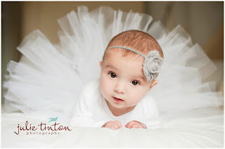
This picture has good lighting which makes the white dress more noticeable than the dull background. This dress outlines the babies head as well as the little headband. The light reflects off the white dress which makes the photograph seem like it has lots of light. The light in this picture would have been artificial and it would have been positioned in a certain way.
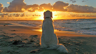
This is another example of a picture with good lighting. The light rays from the sun shines on the centre of the photograph and highlights the dog's body. The bright light that appears in this photograph is mostly blocked by the dogs head, the light becomes dimmer near the tail of the dog and outlines the retriever well. The dog is the main focus in this picture, this picture is interesting because it doesn't follow the rule of thirds. The sun lights up the sea and the beach as well as the dog. This certain picture also raises the question of what kind of sunset can the relaxed looking dog see. In this photograph the photographer has taken advantage of the beautiful natural light that comes from the evening sun.
http://www.picomazing.com/the-dog-wallpaper/
http://julietinton.squarespace.com/julietintoncom/2013/1/9/edinburgh-baby-portraiture-alma.html
http://www.ehow.com/about_6551792_definition-lighting-photography.html
Subscribe to:
Posts (Atom)